Features
Pitching Analytics: Track, Chart, and Develop Your Pitchers
Rizzler's pitching analytics turns every bullpen session and every game outing into detailed charts, accuracy breakdowns, and development trends. You chart pitches on your phone. Rizzler does the math. You see exactly what's working, what's not, and how each pitcher is improving over time.
Capture pitch locations on your iPhone or iPad. View charts right on your phone or go deep in the web app. Rizzler has a full analytics layer with heatmaps, accuracy grids, velocity tracking, pitch sequencing, and cross-session trends, designed for youth baseball and softball coaches who want data without the complexity.

Whether you coach 10U rec ball or 14U travel, pitching analytics gives you the tools to have real conversations with your pitchers about their development, backed by data instead of guesswork.
How It Works
Pitching analytics starts with recording pitches. You can do this during bullpen sessions at practice or during live games. The data flows into charts and trends automatically.
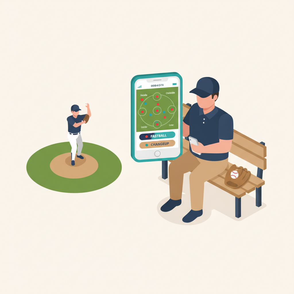
Step 1: Record Bullpen Pitches
Open the Rizzler iOS app and start a bullpen session for any pitcher on your roster. For each pitch, tap the zone where it landed, select the pitch type (fastball, curveball, changeup, slider, etc.), and mark the result. If you have a radar gun, you can add velocity. It's optional but adds another layer to the analytics.
The charting interface is the same one used for in-game pitch charting, so your data is consistent across practice and games.
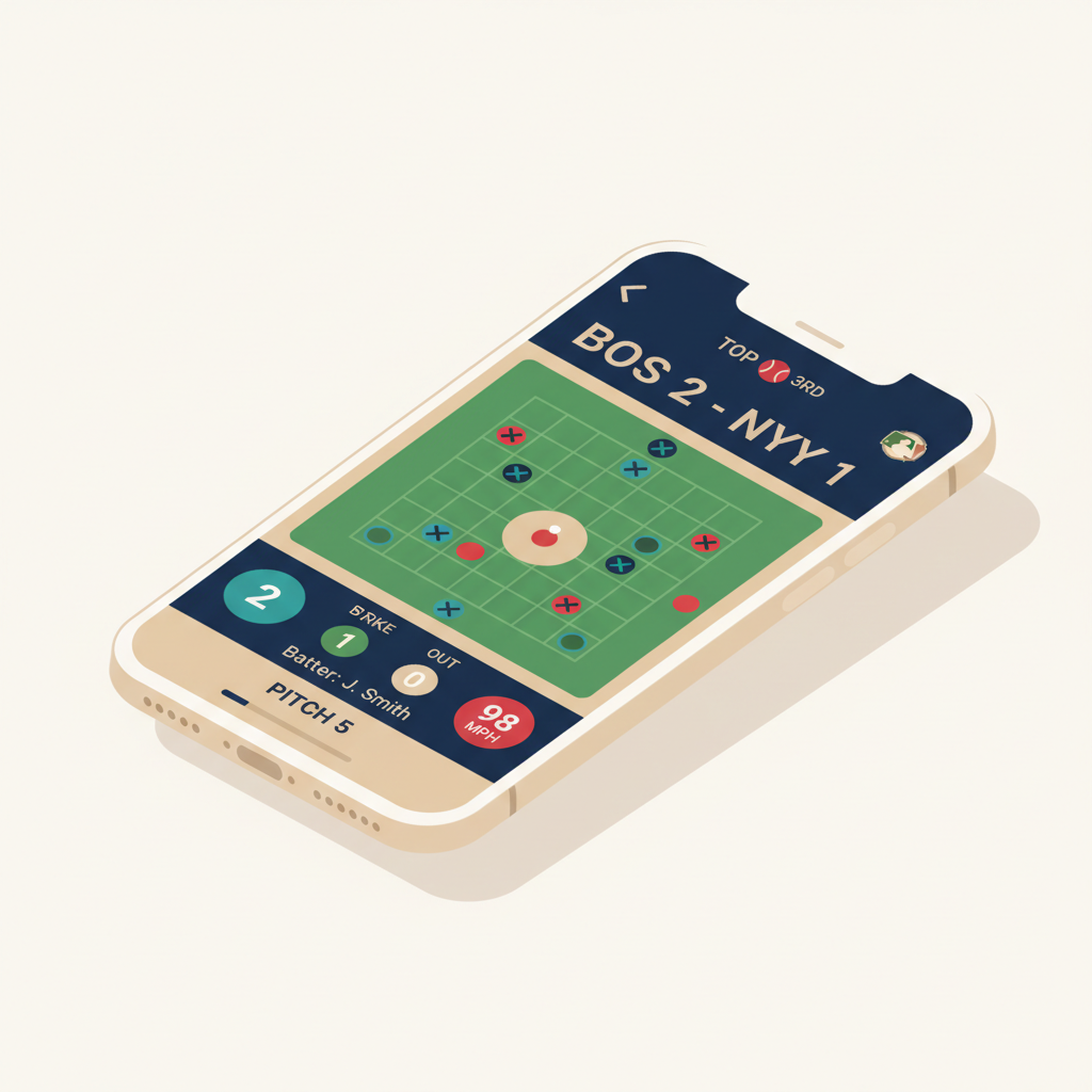
Step 2: Record Game Pitches
During live games, in-game scoring captures pitching data automatically. Every pitch is logged with its location, type, and result, plus game context that bullpen sessions don't have: the count (balls and strikes), which batter is up, their handedness, the inning, and the number of outs.
You don't need to do anything extra. If you're already scoring the game in Rizzler, the pitching data is there.
Step 3: View Single Session Analytics
After a bullpen or game, open Pitching Analytics from the web app or iOS app. Select the pitcher and pick a session. Rizzler generates a full analytics breakdown: heatmaps, accuracy grids, pitch mix charts, velocity trends, sequence patterns, and AI-generated insights.
You can filter everything by pitch type, count situation, or batter handedness.
Step 4: Track Development Over Time
Switch to the "Over Time" tab to see how a pitcher is developing across multiple sessions. Accuracy trends, velocity changes, pitch mix evolution, weekly workload, and consistency metrics. Everything is displayed on a timeline so you can spot improvement (or regression) at a glance.
Add milestones to mark key moments: "First game with curveball," "Hit 60 mph," "Made all-stars." They show up as annotations on the trend charts.

Single Session Charts
When you select a session, you get a full set of charts. Here's what each one shows and why it matters.
Strike Zone Heatmap
A color-coded density map of where pitches landed across the strike zone. Hot zones (red) show where the pitcher throws most often. Cool zones (blue) are areas they rarely hit. Use it to spot tendencies. Is the fastball consistently arm-side? Is the curveball bouncing before the plate?

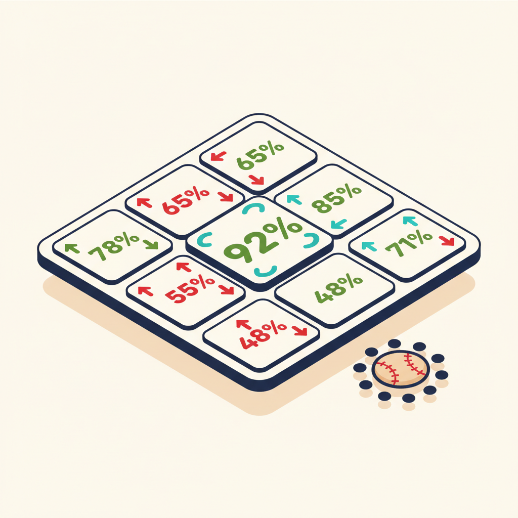
9-Square Accuracy Grid
The strike zone is divided into nine squares. For each square, Rizzler calculates what percentage of pitches aimed at that zone actually landed there. You can toggle between strict accuracy (hit the exact zone) and loose accuracy (hit the target or an adjacent zone). Loose accuracy is more forgiving and useful for younger pitchers who are still developing command.
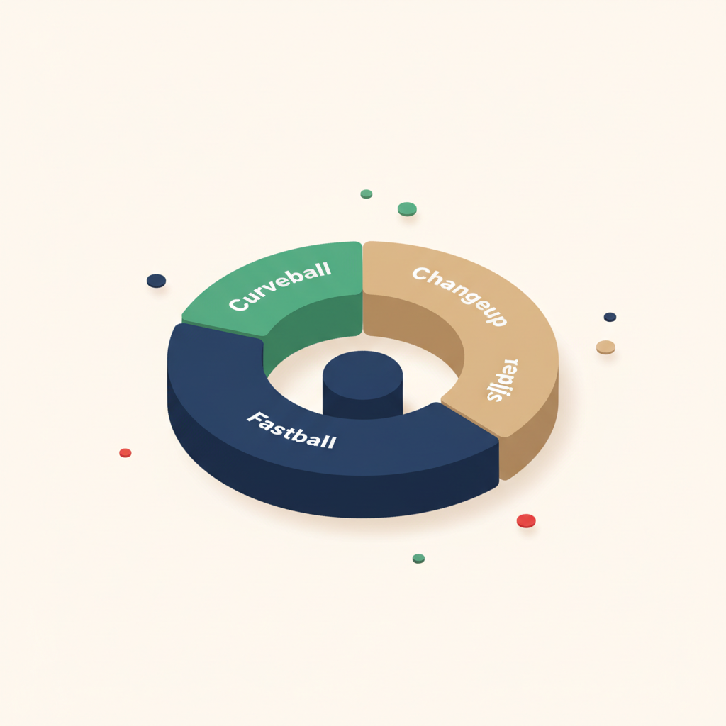
Pitch Mix Donut
A donut chart showing the distribution of pitch types in the session. At a glance, you can see if a pitcher is throwing 80% fastballs, or if they're mixing in off-speed effectively. Compare this to the game plan you discussed. If you wanted more changeups, the data tells you whether it happened.
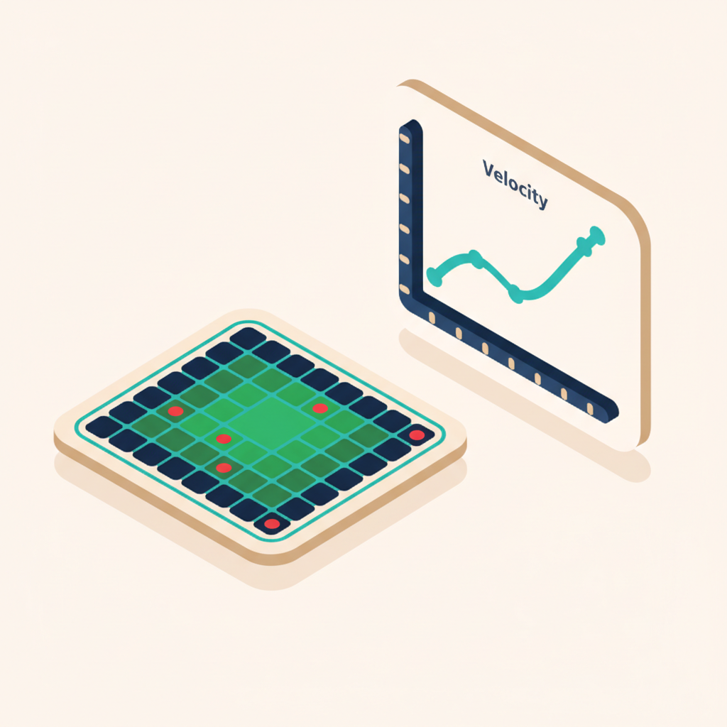
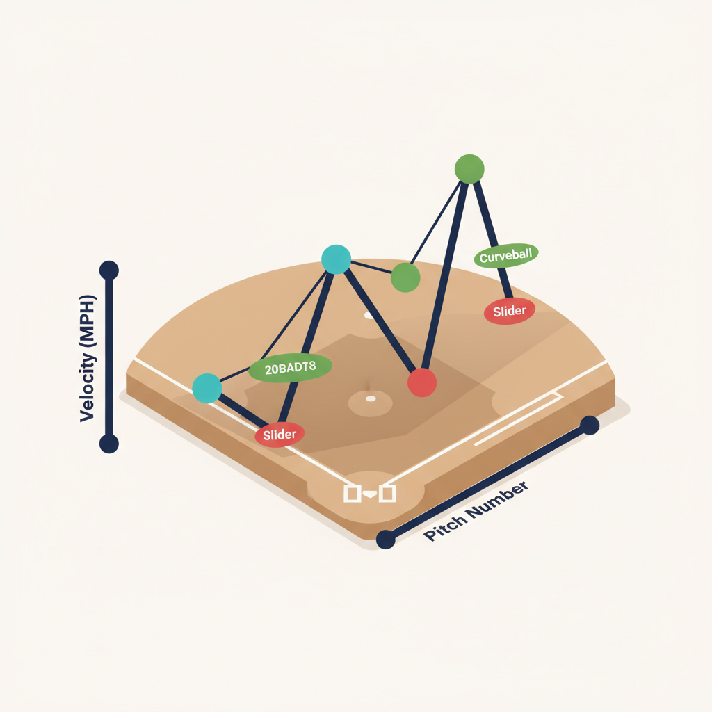
Velocity Line Chart
A pitch-by-pitch velocity line, color-coded by pitch type. Watch for patterns: does velocity drop in the fourth inning? Does the curveball speed stay consistent or creep up toward fastball speed (a sign of lazy spin)? Velocity data requires manual entry during bullpen sessions or a connected radar gun.
Velocity Summary Table
A quick-reference table showing average, max, and min velocity for each pitch type in the session. The numbers you'd jot down on paper, except they're calculated automatically.
Velocity Differential
Shows the speed gap between the fastball and each off-speed pitch. A good changeup should be 8-12 mph slower than the fastball. If the gap is only 3 mph, it's not fooling anyone. This chart makes the differential obvious.

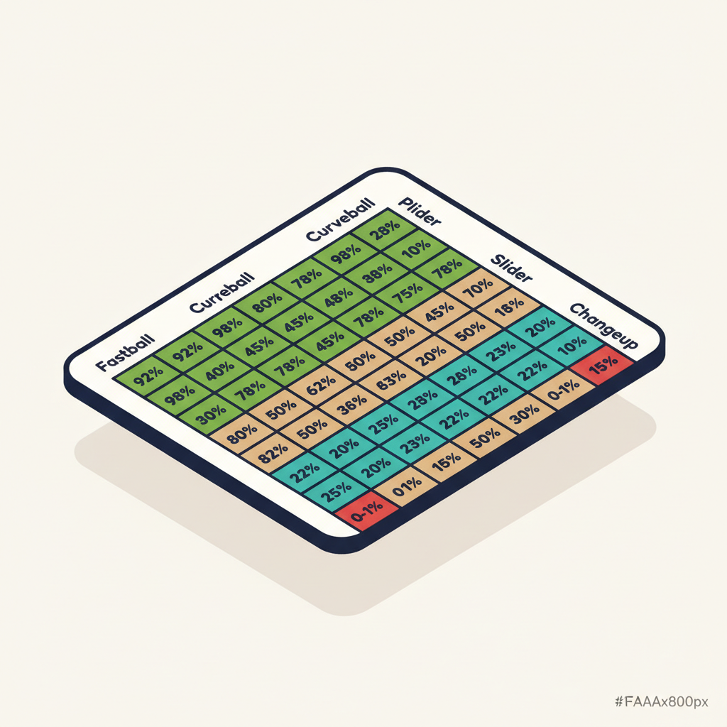
Sequence Matrix
A grid showing what happened when one pitch type followed another. Fastball → curveball: 72% accuracy. Curveball → changeup: 55% accuracy. This tells you which sequences your pitcher executes well and which ones need work. If accuracy drops every time they throw a slider after a fastball, that's a practice focus area.
Insight Callouts
AI-generated observations based on the session data. Things like "Accuracy improved 12% in the second half of the session" or "Velocity dropped below average after pitch 45." These are rules-based and scan for patterns you might not spot by looking at charts alone.

Game-Only Analytics
When the session comes from a live game (not a bullpen), you get additional charts that use the game context data.
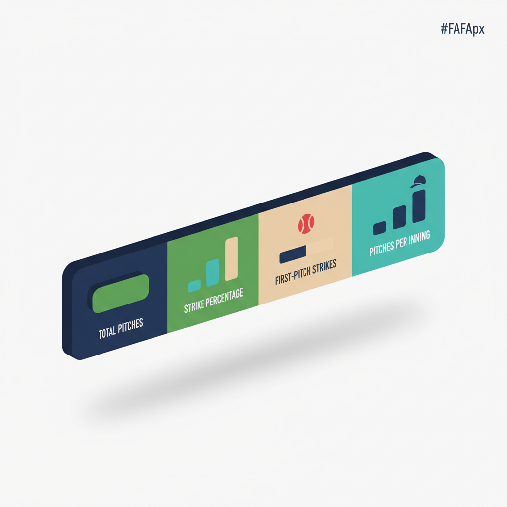
Headline Stats
A summary bar at the top showing total pitches, strike percentage, first-pitch strike percentage, and pitches per inning. The numbers a pitching coach checks first.
At-Bat Log
A pitch-by-pitch breakdown of every at-bat, showing the sequence and result. "FB strike, CH ball, FB foul, CB swinging strike, strikeout." Useful for post-game review with the pitcher.
Count-Based Pitch Mix
How the pitcher's pitch selection changes based on the count. Ahead in the count? More off-speed. Behind? All fastballs. This chart shows whether the pitcher is using their full arsenal situationally or falling into predictable patterns.
Whiff Rate
Percentage of swings that missed. A high whiff rate on the curveball is a good sign. A high whiff rate on the fastball might mean it has good movement, or it might mean hitters are early and the fastball is slow. Context matters, and the chart gives you the data to have the conversation.
Handedness Splits
Performance broken down by left-handed and right-handed batters. If the curveball is unhittable against righties but gets crushed by lefties, you'll see it here.
Trends: Development Over Time
The "Over Time" tab aggregates data across all sessions for a pitcher. This is where you track development week to week and month to month.
Development Summary
A card showing overall stats: total sessions, total pitches, average accuracy, average velocity, and trend direction (improving, declining, or stable). Quick snapshot of where the pitcher stands.
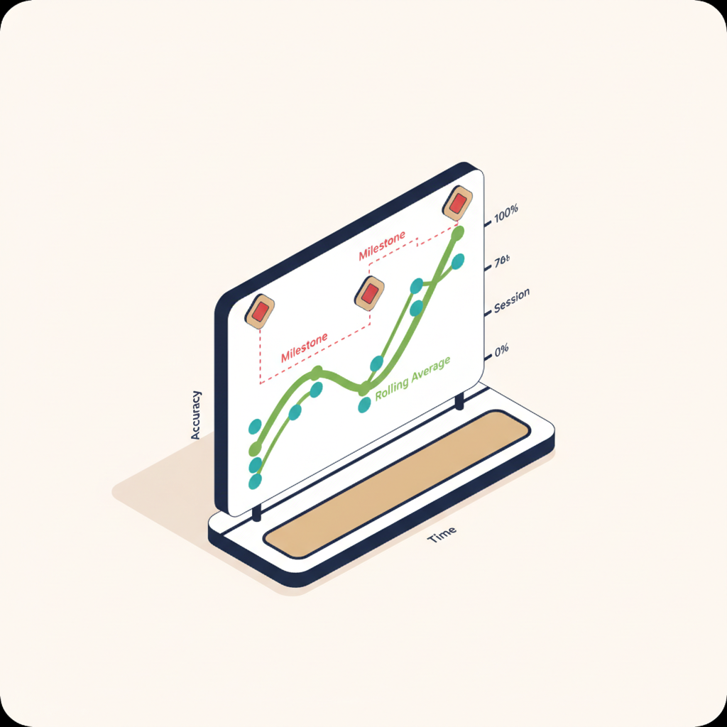
Accuracy Over Time
A line chart plotting accuracy per session with a rolling average. Milestone annotations appear on the chart so you can see if accuracy jumped after a specific coaching change or practice drill.
Velocity Over Time
Average and max velocity per session, plotted on a timeline. Watch for natural velocity development over a season, or spot early signs of fatigue if velocity starts declining.
Weekly Pitch Volume
A bar chart showing total pitches per week. Useful for monitoring workload alongside pitch count limits. If volume spikes during tournament weekends, the chart makes it visible.
Pitch Mix Evolution
A stacked area chart showing how the pitcher's pitch type distribution has changed over time. Early in the season, maybe they threw 90% fastballs. By mid-season, the changeup is up to 25%. That's progress, and the chart shows it clearly.
Consistency Metrics
Per-pitch-type standard deviations for accuracy and velocity. Lower standard deviation means more consistent. If the fastball accuracy bounces between 40% and 80% session to session, the consistency score flags it. If it stays between 65% and 75%, that's tight, and the chart tells you so.
Aggregated Sequence Matrix
Like the single-session sequence matrix, but averaged across all sessions. Shows which pitch-to-pitch transitions the pitcher consistently executes well and which ones are still developing.
Milestones
A timeline of coach-added milestones. "Learned curveball grip, Jan 15." "First complete game, March 8." "Hit 65 mph, April 22." These annotations appear on trend charts and give context to the data points.
Filters
Both the Single Session and Over Time views support filters:
| Filter | What It Does |
|---|---|
| Pitch Type | Show data for only one pitch type (e.g., just curveballs) |
| Count Situation | Filter by Pitcher Ahead, Even, Batter Ahead, Two-Strike, or First Pitch |
| Batter Handedness | Show data against only LHB or RHB (game sessions only) |
| Date Range | Limit trends to Last 30 Days, Last 90 Days, or All Time |
| Session Type | Filter by Bullpen or Game sessions in the trends view |
Glossary
| Term | Meaning |
|---|---|
| Strict Accuracy | Pitch landed in the exact target zone |
| Loose Accuracy | Pitch landed in the target zone or an adjacent zone |
| Whiff Rate | Percentage of swings that missed the ball |
| StdDev | Standard deviation; lower means more consistent |
| Rolling Average | Average of the last 5 sessions, smoothing out individual variation |
| First-Pitch Strike % | Percentage of at-bats that started with a strike |
| Velocity Differential | Speed gap between the fastball and an off-speed pitch (mph) |
| Count Situation | The state of the count: Pitcher Ahead, Even, Batter Ahead, Two-Strike, or First Pitch |
| Pitch Mix | Distribution of pitch types thrown (e.g., 60% FB, 25% CH, 15% CB) |
| Sequence Matrix | Grid showing accuracy when one pitch type follows another |
| At-Bat Log | Pitch-by-pitch record of every at-bat in a game session |
| Handedness Split | Performance data separated by left-handed vs. right-handed batters |
| Milestone | A coach-added annotation marking a development event on the trend timeline |
| Session | A single bullpen practice or game outing for one pitcher |
| Trend Direction | Whether a metric is improving, declining, or stable over recent sessions |
Frequently Asked Questions
What plan do I need for pitching analytics?
Pitching analytics is available on the Pro plan. Basic pitch counting and charting are available on the Free plan, but the full analytics layer (heatmaps, accuracy grids, velocity charts, sequences, trends, and insights) requires Pro.
Does pitching analytics work for softball?
Yes. The charting interface, analytics, and trends work for softball pitching. Pitch types, velocity ranges, and accuracy calculations are sport-agnostic.
How many sessions do I need before trends are useful?
You'll see meaningful trends after 5-6 sessions. The rolling average uses a 5-session window, so once you hit that threshold, the trend lines become informative. Individual session charts are useful from the very first session.
Can assistant coaches access pitching analytics?
Yes. Any coach with head coach or assistant coach access to the team can view pitching analytics for any player on the roster. Data syncs across all coaches in real time.
Where does velocity data come from?
Velocity is entered manually, either during the bullpen session (there's an optional field per pitch) or pulled from a connected radar gun. If no velocity data is recorded, the velocity charts simply don't appear. All other analytics (accuracy, pitch mix, sequences) work without velocity.
Can I track multiple pitchers in one game?
Yes. In-game scoring tracks every pitcher who enters the game. Each pitcher gets their own session in pitching analytics with their own set of charts.
Pitching analytics builds on top of bullpen tracking and in-game scoring. If you're already charting pitches, the analytics are automatic. See also: Pitch Counting & Charting · Strike Percentage
Read Next
Is My Team's Data Secure in Rizzler?
FAQLittle League Age Eligibility — League Age Determination
RulesHow to Balance Playing Time in Youth Baseball
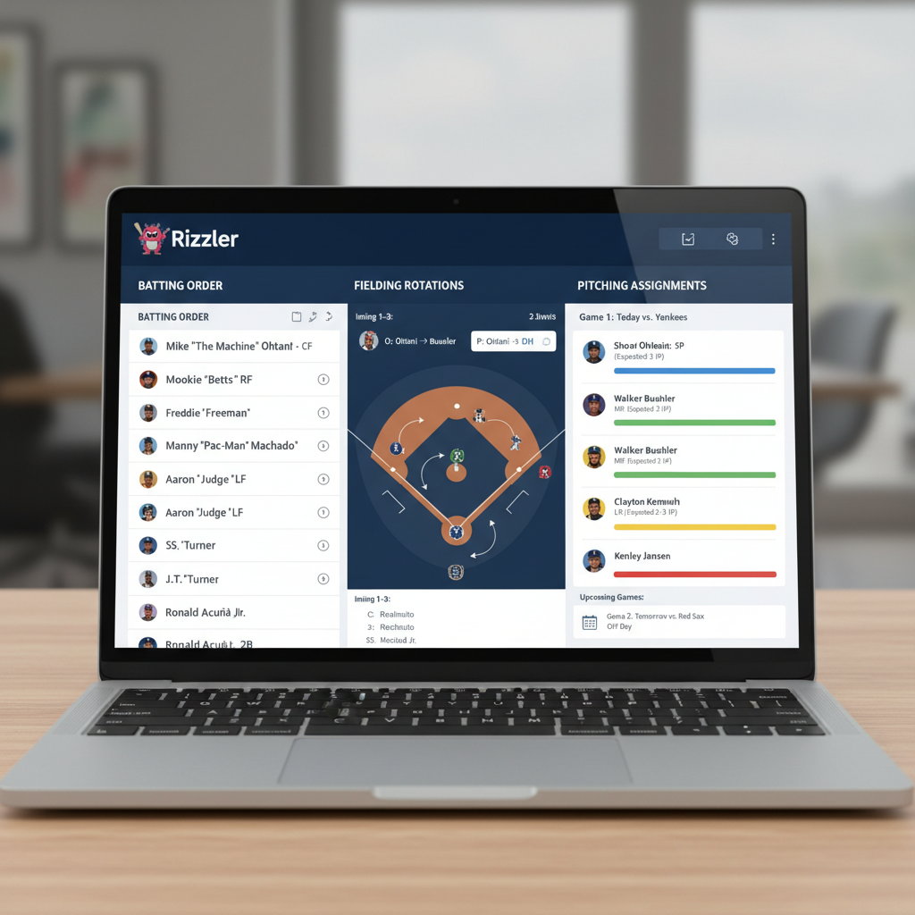
LearnRizzler Web App — Game Planning, Lineups & Team Management
BlogBatting Stats: Every Offensive Stat Explained for Coaches
StatsRizzler for Little League Head Coaches
For Coaches